
 
     |
| Porsche Eater turbo prototypes (Page 3/3) |

|
Matthew_Fiero
|
OCT 02, 09:23 AM
|
|
| quote | Originally posted by Dukesterpro:
The second gen notchback was stunning, im so sad we didnt get it  |
|
And those wrap around taillights.... imagine how much a set of those would be worth now.
|
|
|
|
1985 Fiero GT
|
MAR 24, 11:03 PM
|
|
| quote | Originally posted by 1985 Fiero GT:
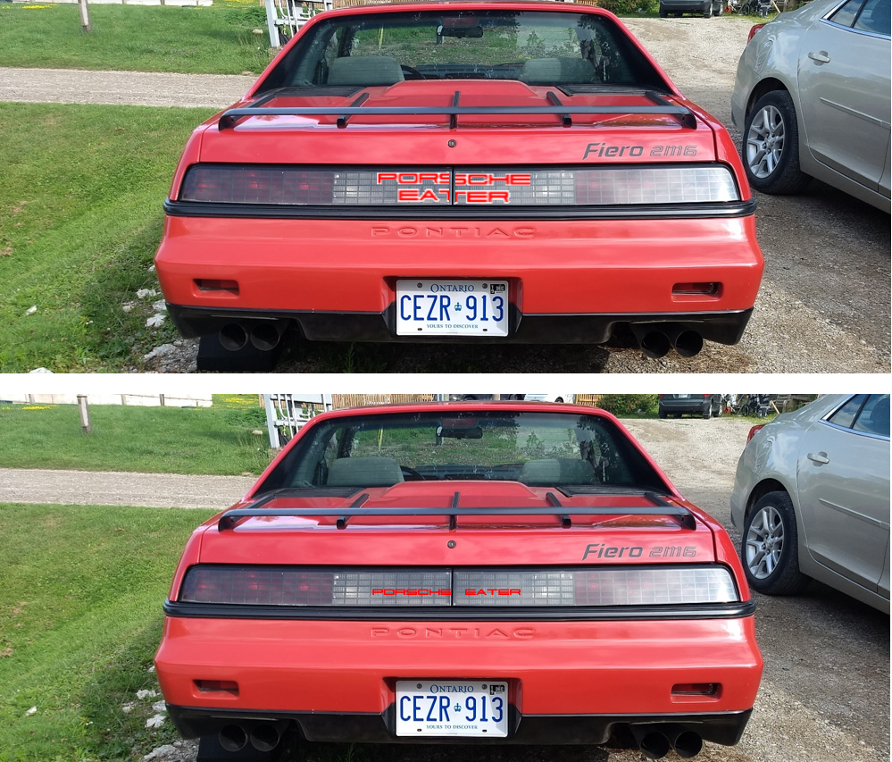
So I guess the Porsche eater taillights are a lost piece of Fiero history? If there were pictures on the forum, they've disappeared, as I have looked everywhere. I really want to replicate that on my Fiero as a finishing touch to the turbo build I haven't started yet (just buying parts and extensive research/planning). Patrick, do you have any recollection on how it roughly looks? I assume it is the full words, PORSCHE and EATER, is it in a blocky font, or more stylized, normal lettering (like the PON-TIAC taillights) or a more italicized font (like Fiero word/logo)? Sorry for all the questions, but this is certainly a valuable piece of Fiero history to be apparently lost. |
|
So, I was fiddling around with this the other day, and i realized that the Porsche font wouldn't work with the words in a single row, it is to wide and short, to make it somewhat fit in the space between the reverse lights, it would be to small to read and misbalanced left to right. However, a centered double row, lines up pretty well top to bottom and left to right, both words split down the middle. Patrick, you remember seeing a picture, but not the details, either of these ring any bells?
|
|

|
Patrick
|
MAR 25, 12:00 AM
|
|
| quote | Originally posted by 1985 Fiero GT:
Patrick, you remember seeing a picture, but not the details, either of these ring any bells?
|
|
To be honest, at this point I'd just be guessing... but I seem to recall it was PORSCHE EATER all in one line, and not one word stacked on top of the other. For the two words to appear centered on the rear panel, the font for PORSCHE might've been slightly narrower so that each word was the same width as the other.
|
|
|
|
1985 Fiero GT
|
MAR 25, 12:03 AM
|
|
| quote | Originally posted by Patrick:
To be honest, at this point I'd just be guessing... but I seem to recall it was PORSCHE EATER all in one line, and not one word stacked on top of the other. For the two words to appear centered on the rear panel, the font for PORSCHE might've been slightly narrower so that each word was the same width as the other. |
|
Ok, interesting, in that case they probably drew up a special font just for this application and/or mixed fonts to make it work, although I do think it would be extra potent for it to be in the actual porsche font, and it fits so well, stacked and split that is.
|
|
|
|