
 
     |
| Started my fiberglass dash build. (pics) (Page 2/6) |

|
Rafe Zetter
|
AUG 26, 06:38 AM
|
|
Looks good sar far,
As im going to be building a custom dash over the winter i'll be watching this thread with great interest, more to see how its done and avoid the pitfalls rather than copying your design.
Good luck and keep us posted.
|
|

|
Taijiguy
|
AUG 26, 07:51 AM
|
|
I don't know if I'm the guy to watch for a "how it's done" or not, but I appreciate the confidence. 
OK, so like I said previously, I kind of wanted to acknowledge the stock Fiero dash in some way, without being too obvious, and having my own design. Soooo....I took a saw and grinder to the stock dash pod and did some careful measuring, and lopped off it's "ears"-
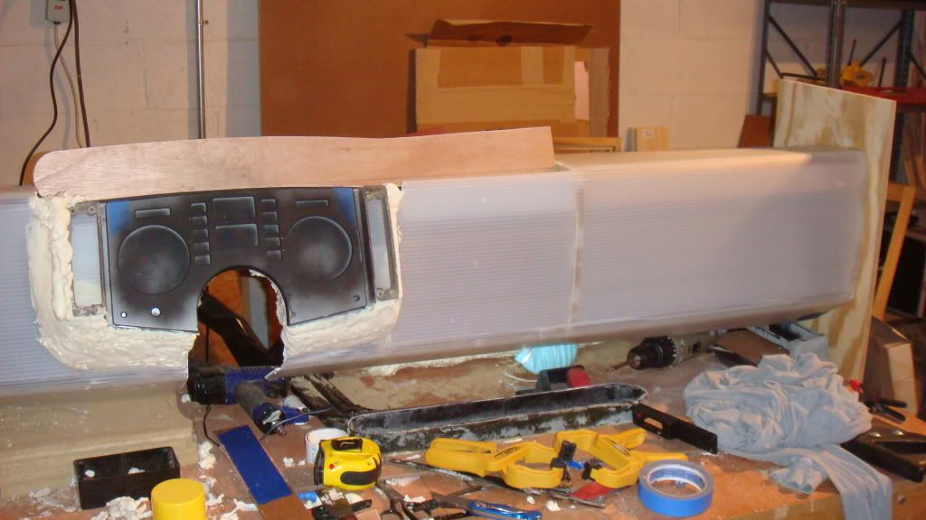
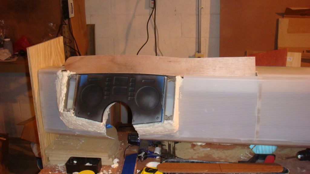
The shape of the area around the pod is pretty close to what I want. The almost straight-back shape on the right is necessary as the edge of the switch mount on that side is right next to the center section which will house the LCD screen is going to be recessed, so no real room for flaring or feathering on that side. I was originally planning to cover the lower dash area with aluminum plate, but now I envision this area painted with a nice high-gloss paint job, with the aluminum fascia/gauge surround. The upper area will still get the All Sport vinyl.
I'm using a set of S/W gauges I purchased from a forum member some time back. I have a matching tach and speedo set.
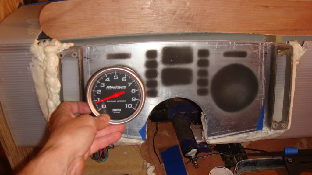
This design also allows me to use the stock gauge cluster for warning lights etc. But I'm not sure if I'm going to go that direction, or if I will have this plate laser cut with custom symbols. Still deciding on that one. You might also notice that the housing for my Glow Shift gauges is different too. I don't think the straight across design of the gauge cluster I first made will look right with the curved top of the stock face plate. So I decided to build a new one that will be one piece and integrate the gauges and the center vent. I *might* also wrap it down along the right side of the center area to provide a shape to define that area and allow for some switches or whatever other features I decide to include.
BTW, I discovered that the stock fascia is NOT symmetrical.
Ya gotta love designing as you go....[This message has been edited by Taijiguy (edited 08-26-2009).]
|
|

|
grkboy707
|
AUG 26, 08:28 AM
|
|
cool! nice work! 
|
|

|
Taijiguy
|
AUG 31, 07:37 AM
|
|
Got to spend a few hours on the dash project this weekend.
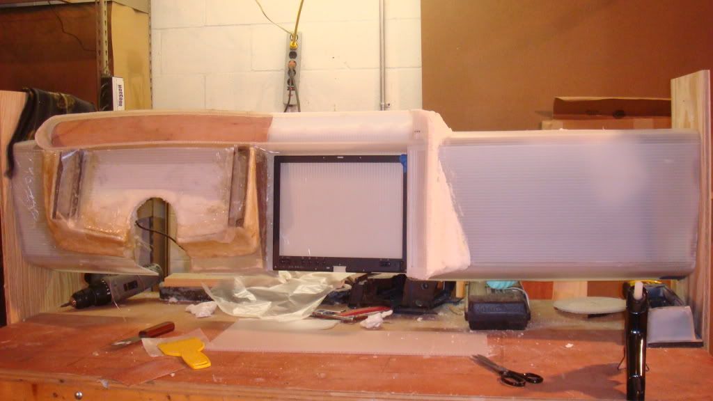
I've been pretty much working my way left to right. Got the instrument pod more or less the way I want it, and got it feathered in with foam on the sides, so started to work on the portion of the gauge housing that will extend over the LCD screen, and the area for the screen itself. I cut out the center section and moved it back a couple of inches, as well as made it more vertical. I also gave it a radius on the right side, and made a flat area to allow for any switches or other components I might want to add as I go. Then I feathered it with foam.
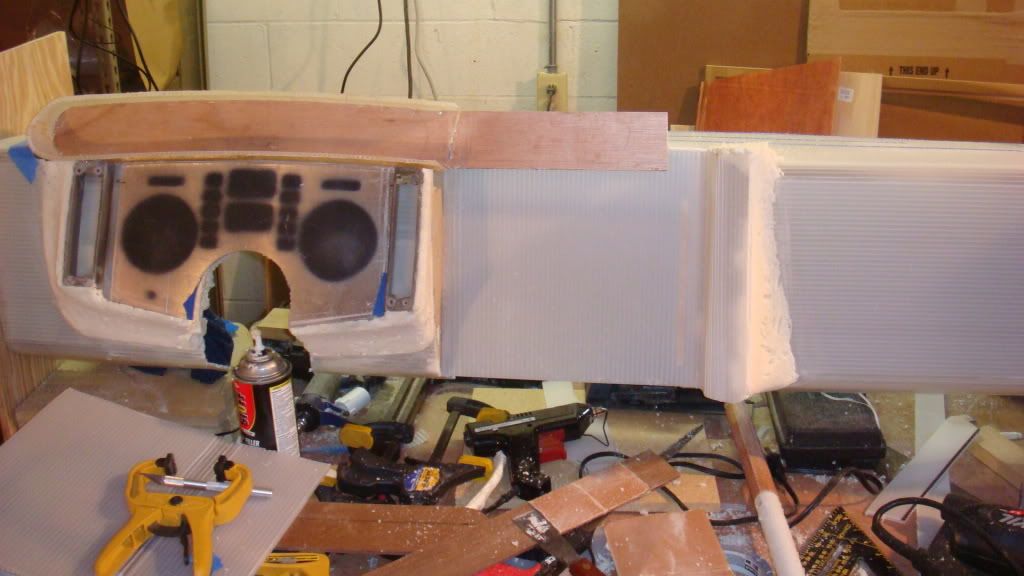
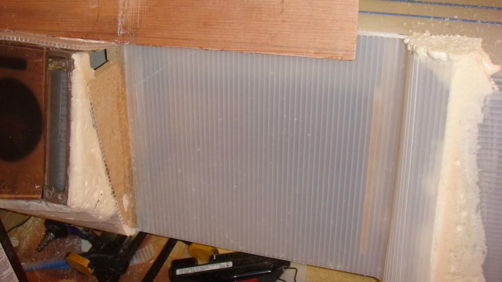
Close-up of the area where the 12" LCD will go.
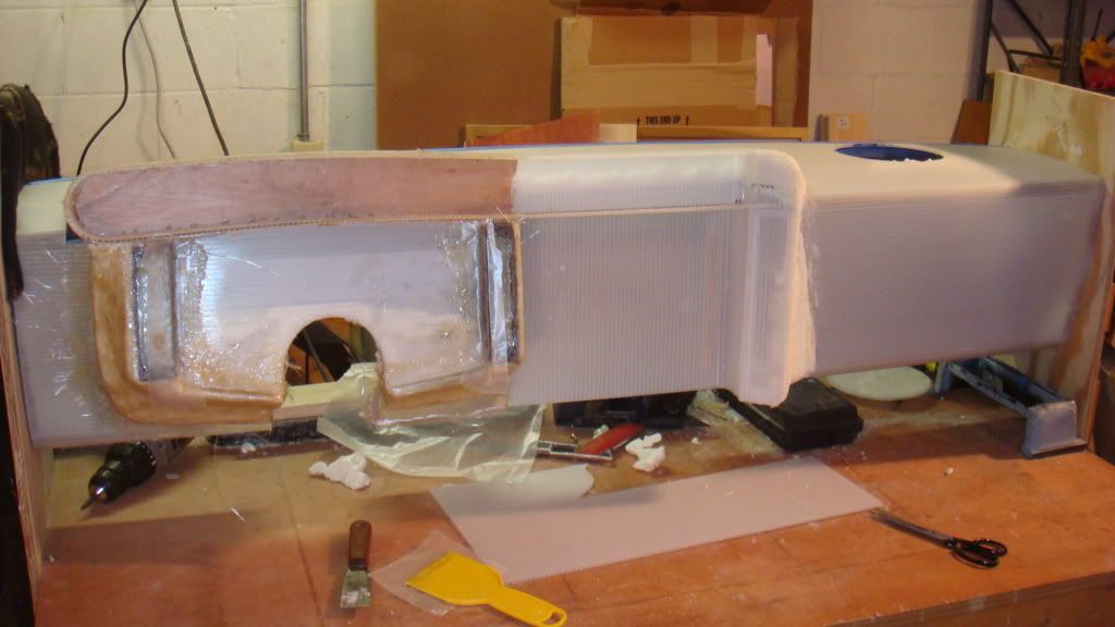
I've completed the gauge surround, and extended it over the center section. I'm pretty sure I'm going to move the center vent up into that space. I laid my first layer of fiberglass over the foam around the gauge pod. You can also see where I defined a sort of frame around the flat area to the right of the LCD screen. I think one thing that makes projects like this look amateurish is the lack of detail and depth. When everything is just flat and smooth it doesn't have that "finished" look. I'm adding small details as I go that will give this dash a nice refined look (I hope) while not going overboard.
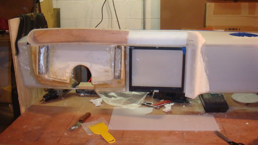
Here I've taken the bezel from the laptop I'm using for the Car PC and placed it just to give an idea of the size and shape. I'm not using the bezel itself, although I will be scrounging parts from it to use. It has a fingerprint reader, as well as other controls. One side note, it's an IBM X41 tablet PC. As many computers as I've worked on, I've not worked on that many tablet PC's. All of the tablets I've worked on (Mostly Toshiba Toughbooks) would recognize finger taps to the screen. Apparently most tablets don't, they actually have a digitizer attached to the back of the LCD, so they aren't actual touchscreens, and will only respond to a stylus. (D'oh) I only realized that after tearing this one apart. I considered the situation, and realized I didn't want to have to deal with a stylus when using a this. Fortunately, there was a guy selling 12" touchscreen overlays on Ebay for a pretty cheap price, so I snagged one of those and separated the digitizer from the back of the IBM screen.
Anyway, here's the bezel in place just to give an idea of how the screen will fit in that area
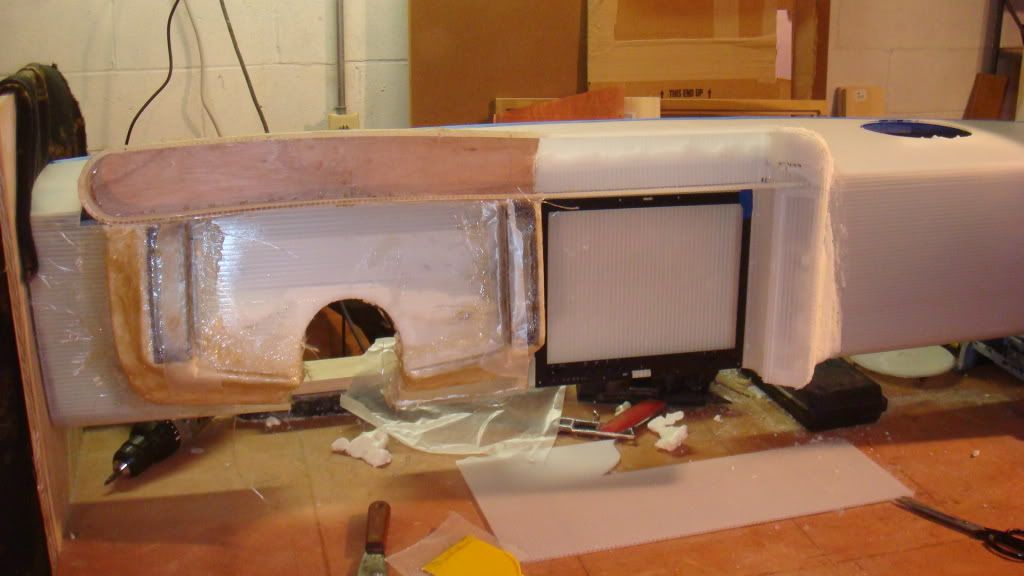
This is how it looks at the moment. A little refinement and I'll be ready to move over to the glove compartment. Yes, I'm putting in a real glove compartment.
|
|

|
Taijiguy
|
AUG 31, 07:59 AM
|
|
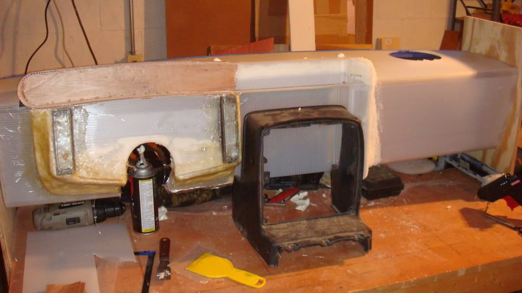
I thought I would throw these out for anyone who might be curious as to how this dash compares to the stock dash in terms of height, and where the center section is actually going to be. The dash is set in my jig here so that the center console section would slide right in, and be sitting on the work surface. So I placed the console in here this way to show you the extra height of my dash design. I figured I could add about 5 or 6 inches to the overall height of the dash and still be able to see the bottom of the windshield. It looks like my dash is about 3 1/2- 4 inches higher than stock.
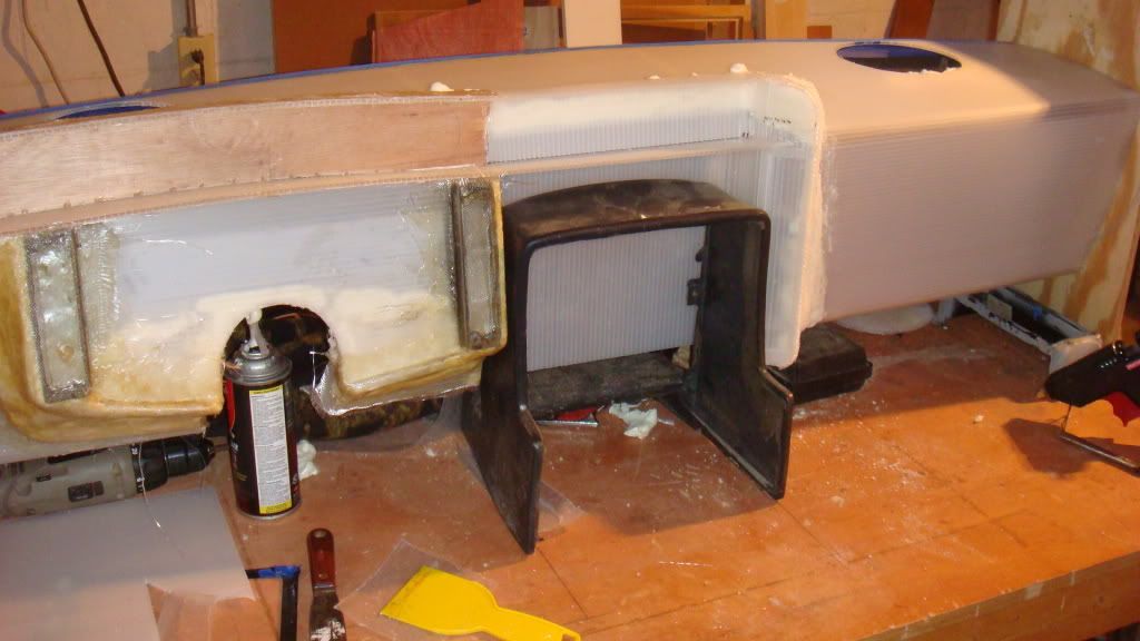
Here, I flipped the console around so it would slide under (since the outside lip is lower than the back lip) this gives you a general idea of how far I set my LCD back from the stock location. I'm guessing it's back a good 1 or 2 inches. Little chance of interference with the shifter in this set up.
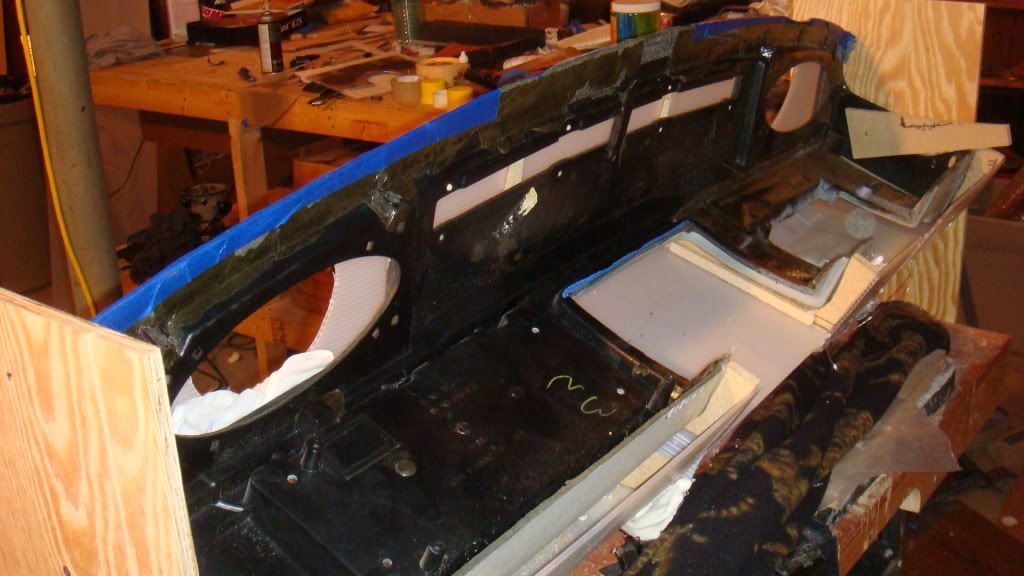
And finally, I flipped the whole thing over so you can see how it all fits together. The stock dash is providing the main support right now, but much of it will be cut away when all the glass work is done. In fact, I've planned this whole project out so that I can completely remove the stock dash from the new shell once I have my glass laid on the outside surfaces. Then I can lay glass along the entire inside surface, and put the stock dash back in place, trim away all of the excess and unneeded material, and then glass what left to the new shell. This gives me all stock mounting for the dash itself, as well as original mounting and positioning for the HVAC ductwork.
 [This message has been edited by Taijiguy (edited 08-31-2009).]
|
|

|
Arns85GT
|
AUG 31, 09:07 AM
|
|
Taji you're a brave guy to take this on. Looks like you are doing, as usual, a quality job.
On style, please forgive my observation here, but, I think the dash looked better before you cut into it for the Fiero bezel.
If I were doing it, I'd leave out the stock Fiero template and look entirely. I would give it the custom rod look. Maybe a custom indentation with overhang to give the guages some shade and reduce glare.
The new guage pod with blacked out guages is very cool, and the tablet PC idea brings you right up to date.
I think I'd leave out the stock Fiero touch though.
Good luck on the project
Arn
|
|

|
Taijiguy
|
AUG 31, 09:34 AM
|
|
| quote | Originally posted by Arns85GT:
Taji you're a brave guy to take this on. Looks like you are doing, as usual, a quality job.
On style, please forgive my observation here, but, I think the dash looked better before you cut into it for the Fiero bezel.
If I were doing it, I'd leave out the stock Fiero template and look entirely. I would give it the custom rod look. Maybe a custom indentation with overhang to give the guages some shade and reduce glare.
The new guage pod with blacked out guages is very cool, and the tablet PC idea brings you right up to date.
I think I'd leave out the stock Fiero touch though.
Good luck on the project
Arn |
|
LOL Now you tell me....
I don't know if this changes your opinion, but really, the only thing that will have any resemblance to the stock dash is the shape of gauge cluster there, and the location of the switches. I'm definitely not using the stock gauge bezel, I'll either paint or powder coat that aluminum plate for the bezel. Also I'm not using the stock fuel or water temp gauges, so those rectangular cutouts won't be there either. I may move my fuel gauge down into that area as I intend to add a wideband O2 gauge at some point. I'm not going to use the stock switches either. I'm going to fab aluminum plate to replace the stock switch bezels and use later model illuminated switches. Also, the "idiot lights" are going to be different. I have a good working relationship with a sign company here that has a CNC. I'm going to have him cut symbols into .030" aluminum sheet which will be bonded to the back of the 1/8" plate that you see in the pictures. I'll attached colored gels to the back of the .030 sheet, or use clear plexi with colored LEDs for the indicator lights.
I'll take your advice into consideration though. I'm not attached to any particular idea, it's just what I came up with, but I always welcome ideas. It's part of the reason I posted this thread. I know I'm not going to think of everything. And I'm not afraid to tear something apart and do it over..such as the original gauge pod shape.
|
|

|
Taijiguy
|
SEP 02, 12:45 AM
|
|
Not much progress on the build the last couple of days. We have out of town guests coming for the weekend, so lots of hunnee-doo stuff coming first. I did get a chance to stick the dash in for a test fit tonight.
Looking from outside of the car
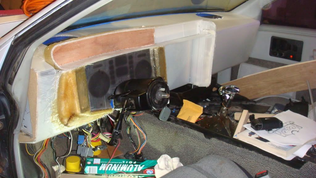
This is the view from the driver's seat
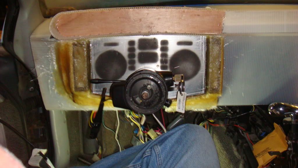
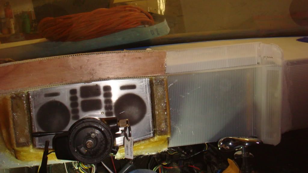
The height is perfect, still have full view out of the windshield
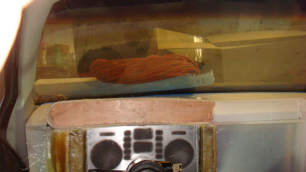
Arn's comments got me to thinking. The dash pod was built to be removable, so I had to part it from the dash anyway as it's a separate piece. Once I got it off I started to consider other alternatives. I spent a little time doing this just to get an idea of what it would look like. I'll shape the foam when I have some free time and get some pics up. (Hey Arn, Is this what you had in mind...?  ) )
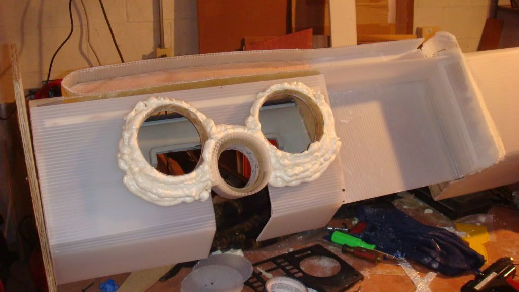
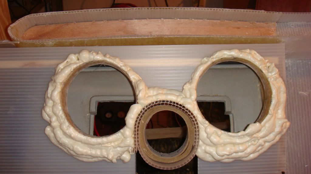
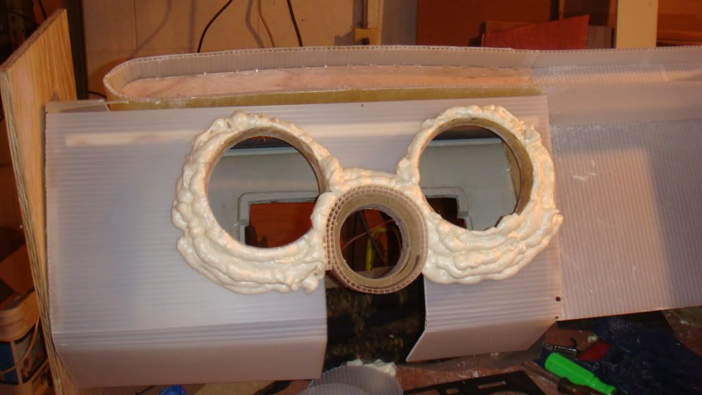
So how about a consensus and some suggestions? The first design, or the second design? What do you like or dislike about each one? Let's have some feedback. Obviously, you aren't going to hurt my feelings, I'm more interested in good ideas than in preserving my ego...
|
|

|
Ang84Indy
|
SEP 02, 02:35 AM
|
|
|
Looking good. IMO a completely custom gauge cluster would look better than the stock cluster in the middle of a custom dash.
|
|

|
Taijiguy
|
SEP 02, 09:30 AM
|
|
...hard to believe there's so few people with an opinion around this place!
I'm actually coming to like the second design better. I have a lot of cool ideas developing around that layout.
|
|
    
  |
|
